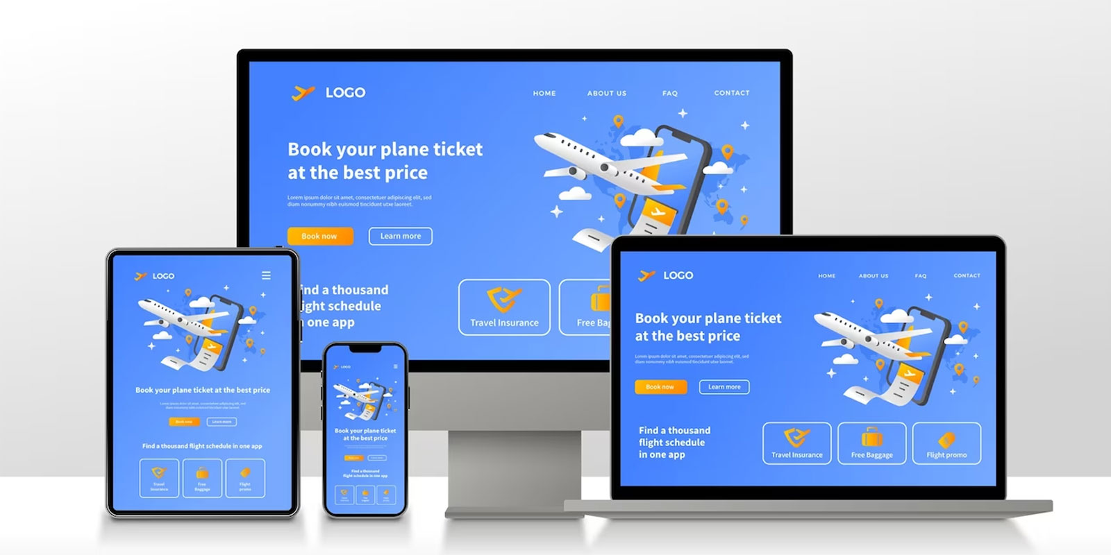
A responsive website is no longer an option—it is now required because users interact with it on several devices. Leading the way in web design, Vdezine Global enables companies to revolutionize their online presence with innovative and responsive website designs.
The Importance of Responsive Design
Users need a smooth and uniform experience across all platforms at a time when smartphones and tablets are an essential part of our everyday existence. Recognizing this change in customer behavior, Vdezine Global bases the foundation of its services on responsive design. A flexible website adapts dynamically to various screen sizes, guaranteeing maximum use and visual appeal.
Adapting to the Mobile-First Era
Prioritizing mobile devices above other platforms is not only a fad; it is essential. Smartphones account for a large amount of web traffic, so Vdezine Global prioritizes the mobile experience in its responsive designs. Because search engines prioritize mobile-friendly websites, this strategy improves user experience and has a beneficial effect on search engine results.
Improved User Experience Across Devices
The success of any online business depends greatly on the quality of the user experience. Vdezine Global’s responsive designs ensure an improved and consistent user experience regardless of the device. With smooth navigation and eye-catching layouts, your website becomes a user-friendly center that draws users in and promotes discovery.
Optimized for Search Engines
User experience-focused websites are given preference by search engine algorithms, and responsive design plays a significant role in this. Search engine optimization best practices are incorporated into Vdezine Global’s plans, which will help your website rank better in search engine results. This raises awareness of your company and brings natural traffic to your website.
Flexibility and Scalability
Your website has to change along with the business environment. Responsive designs from Vdezine Global offer the scalability and flexibility required for future expansion. Your website is flexible enough to accommodate changes to your business, such as adding new services, including e-commerce features, or increasing the range of products you provide.
Consistent Brand Presentation
For internet firms, keeping a consistent brand image is essential. The responsive designs from Vdezine Global easily transfer your brand’s identity across a range of devices. The uniform presentation, from color schemes to logo positioning, guarantees that your brand is identifiable and fosters audience trust.
Reduced Bounce Rates and Higher Conversion Rates
Responsive designs positively impact both reduced bounce rates and higher conversion rates. Users are more likely to explore your website longer, look over your products, and become clients when they can easily access it on any device. The emphasis that Vdezine Global places on responsive design has a direct bearing on your online business’s profitability.
Performance & Speed
In the digital era, speed is critical. The responsive designs from Vdezine Global put performance and speed first, so your website loads swiftly across all platforms. This improves consumer happiness while also helping search engine rankings since algorithms place a high value on speed.
The flexible website designs created by Vdezine Global are evidence of the company’s dedication to customer success and innovation in the digital sphere. Businesses may seize many benefits by adopting responsive design concepts, from enhanced user experience and search engine rankings to higher conversion rates. With the transformational and responsive website designs from Vdezine Global, you can uplift your online business, embrace the mobile-first world, and remain ahead of the curve.